Summary. Appearance#
Flexible TreeView allows you to completely redesign the summary appearance as needed by using these summary properties:
- WrapToNextLevel - Defines whether to move the summary to the next summary level.
- IncludeChildrenNodes - Determines whether to calculate summary value only for the specified node's child nodes or for the node's child nodes including their child nodes (default).
- Stretch - Defines whether to stretch the summary display area to fill all available space. If enabled, all summaries after it will be auto-wrapped to the next level.
- Visible - Controls the summary visibility.
- Width - Defines the summary's width in pixels.
- DisplayFormat - Allows customization of the summary value's format.
- Alignment - Defines the summary's alignment within the available display area. If there are multiple summaries to display with different alignments, the first summary's alignment will be applied to all additional summaries on the same level.
- TextAlignment - Defines the summary text's alignment within summary bounds.
- BorderColor - Allows to override the summary's border color. The default border color is defined in the treeview's theme.
- BackgroundColor - Allows to override the summary's background color. The default summary background color is defined in the treeview's theme.
You can also change appearance of all summaries using data provider settings.
WrapToNextLevel#
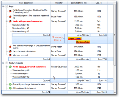
Flexible TreeView supports displaying summaries on multiple levels:

To move a summary to the next level, enable the WrapToNextLevel summary property. On each separate level, you can align summaries differently as shown in the picture above.
IncludeChildrenNodes#
By default, summary calculates the value of the specified node's child nodes and all their child nodes. You can configure the summary to use only the node's immediate child nodes by disabling the IncludeChildrenNodes summary property.
DisplayFormat#
By default, summary shows the aggregated value in this format:
[Summary operation name][Operation delimiter][Summary value]
Example
Count=45
To change the summary value output format, use the DisplayFormat summary property. Enable the Enabled property and fill the FormatText property with a custom format pattern.
When the summary formats the output value, it uses three placeholders specified in the FormatText property:
{0}- To insert the summary operation short name.{1}- To insert the operation delimiter.{2}- To insert the summary value.
You can use these placeholders in your custom format as well.
For example, to change the operation's delimiter string to :, use this string for the FormatText property:
{0}:{2}
BorderColor, BackgroundColor#
By default, the summary's border and background colors are controlled by the treeview's current theme. You can override them using BorderColor and BackgroundColor summary properties. To revert to the theme's settings, assign Color.Empty to the BorderColor property and null to the BackgroundColor property.
Text color#
To change the summary text color, use a custom display format with the 'font' HTML tag as shown below:
This example changes the summary value's text color to red and makes it bold.
Image#
You can display an image in the summary by using the Image summary property. To align the image, use the ImageAlign summary property.
Run-time appearance customization#
You can customize every summary's appearance at run-time by using the PaintSummary and PaintSummaryBackground treeview events to draw the summary's value and background respectively.