Get started
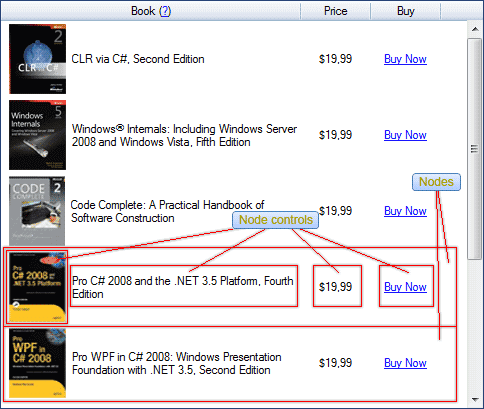
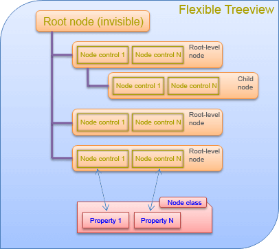
Node is a first-class citizen of the Flexible TreeView. It is derived from ARMSoft.FlexibleTreeView.Nodes.Node class and contains all data properties that are bound to the node controls via the DataFieldName node control property.
Each node in the treeview is one instance of the node class.

Every node consists of node controls added to the treeview which are bound to node class's members (properties or fields).

Root node#
The treeview has one root and invisible node, accessible through the Root treeview property. The root node is the parent of all root-level nodes and you can't delete or show it.
Flexible TreeView provides quick access to all root-level nodes through the Nodes treeview property.
Row index#
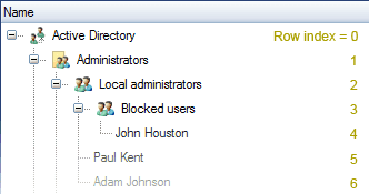
Every visible node has its own unique row index in the treeview, starting from 0 for the first top node. This index is stored in the Row node property and is used to identify and find the node in the treeview.

Child nodes#
Every node may have an unlimited number of child nodes, accessible via the Nodes property.
Node population#
Any nodes types, inherited from the ARMSoft.FlexibleTreeView.Nodes.Node class, can be added to the treeview at the same time. This allows binding one node control to different data or data types in those nodes.
The example below shows how different type of nodes, FileNode and DirectoryNode, can be added to the treeview at the same time. Note that although these nodes has different types, FileNode and DirectoryNode, both of them have the ObjectType property which is bound to the NodeTextBox node control.
abstract class DiskObjectNode : Node
{
  public abstract string ObjectType { get; }
}

class FileNode : DiskObjectNode
{
  public override string ObjectType => "File";
}

class DirectoryNode : DiskObjectNode
{
  public override string ObjectType => "Directory";
}

// Add node controls to show the object name and type (file or directory).
NodeTextBox objectName = new NodeTextBox();
// Bind to the built-in node property.
objectName.DataFieldName = "Text";
objectName.AttachTo(tree);

NodeTextBox objectType = new NodeTextBox();
// Bind to the virtual property with different content according to the node type.
objectType.DataFieldName = "ObjectType";
objectType.AttachTo(tree);

// Add nodes of different types.
DirectoryNode folder = new DirectoryNode();
folder.Text = "Windows";
folder.AttachTo(tree);

FileNode fn = new FileNode();
fn.Text = "autoexec.bat";
fn.AttachTo(folder);
MustInherit Class DiskObjectNode
    Inherits Node
    Public MustOverride ReadOnly Property ObjectType As String
End Class

Class FileNode
    Inherits DiskObjectNode
    Public Overrides ReadOnly Property ObjectType As String = "File"
End Class

Class DirectoryNode
    Inherits DiskObjectNode
    Public Overrides ReadOnly Property ObjectType As String = "Directory"
End Class

' Add node controls to show the object name and type (file or directory).
Dim objectName As New NodeTextBox()
' Bind to the built-in node property.
objectName.DataFieldName = "Text"
objectName.AttachTo(tree)

Dim objectType As New NodeTextBox()
' Bind to the virtual property with different content according to the node type.
objectType.DataFieldName = "ObjectType"
objectType.AttachTo(tree)

' Add nodes of different types.
Dim folder As New DirectoryNode()
folder.Text = "Windows"
folder.AttachTo(tree)

Dim fn As New FileNode()
fn.Text = "autoexec.bat"
fn.AttachTo(folder)
Node state#
The node's state defines how the node appears and behaves in the treeview at the current time. As the end-user interacts with the treeview by moving the mouse cursor over the nodes, clicking them, etc., the treeview changes the state of the affected nodes accordingly.
A node can be in one of these states:
- Not selected - node isn't selected.
- Hot - node isn't selected, but it is under the mouse cursor.
- Soft selected - node isn't selected, but it is under the mouse cursor and soft selection mode is enabled. Node is displayed as selected and may change appearance.
- Selected - node is selected.
- Focused - node is selected and has input focus.
The node style can be overridden per each node state as described in the Node style article.
Node auto-height#
Flexible TreeView allows you to create a dynamic and flexible UI, so any node may have a different height depending on its content.
To completely show these nodes, you need to enable the node auto-height calculation by enabling the Options.Node.AutoNodeHeight treeview property; otherwise, all those nodes' content would be cropped.
If you want to show nodes of already known height, you can disable the Options.Node.AutoNodeHeight treeview property and set the node's static height in the PreferredNodeHeight treeview property, it will greatly increase treeview performance.
Note
By default, PreferredNodeHeight treeview property is set to 22 pixels.
Limit node height#
Besides explicit or automatic node height adjustment, Flexible TreeView provides the possibility to limit maximal or minimal node height. To do that, change the MaxHeight and MinHeight node properties respectively. By default, they equal -1, which means the node height is not limited.
CheckBox & RadioButton#
CheckState#
The ARMSoft.FlexibleTreeView.Nodes.Node class has the CheckState property of type ARMSoft.FlexibleTreeView.Nodes.eCheckState, which stores the node's check state. By default, the NodeCheckBox node control is bound to this property.
The eCheckState enum includes the following values:
eCheckState.Unchecked– the node is unchecked.eCheckState.Checked– the node is checked.eCheckState.Unknown– the check state is undefined. This value is used when a parent node's check state aggregates the check states of its child nodes, and some child nodes areCheckedwhile others areUnchecked, and node's ThreeCheckState is enabled.
Example
NodeTextBox orderTitleControl = new NodeTextBox();
orderTitleControl.DataFieldName = "Text";
orderTitleControl.AttachTo(treeView);

NodeCheckBox orderActiveControl = new NodeCheckBox();
orderActiveControl.DataFieldName = "CheckState";
orderActiveControl.AttachTo(treeView);

Node orderNode = new Node()
{
    Text = "Order #1",
    CheckState = eCheckState.Checked
};
orderNode.AttachTo(treeView);
Dim orderTitleControl As New NodeTextBox()
orderTitleControl.DataFieldName = "Text"
orderTitleControl.AttachTo(treeView)

Dim orderActiveControl As New NodeCheckBox()
orderActiveControl.DataFieldName = "CheckState"
orderActiveControl.AttachTo(treeView)

Dim orderNode As New Node() With {
    .Text = "Order #1",
    .CheckState = eCheckState.Checked
}
orderNode.AttachTo(treeView)
CheckType#
The ARMSoft.FlexibleTreeView.Nodes.Node class includes the CheckType property of type ARMSoft.FlexibleTreeView.Nodes.eCheckType, which determines whether a check box or radio button is displayed in the node by the NodeCheckBox node control.
Example
NodeTextBox orderTitleControl = new NodeTextBox();
orderTitleControl.DataFieldName = "Text";
orderTitleControl.AttachTo(treeView);

NodeCheckBox orderActiveControl = new NodeCheckBox();
orderActiveControl.DataFieldName = "CheckState";
orderActiveControl.AttachTo(treeView);

Node orderNode = new Node()
{
    Text = "Order #1",
    CheckType = eCheckType.CheckBox,
    CheckState = eCheckState.Checked
};
orderNode.AttachTo(treeView);

Node itemNode = new Node()
{
    Text = "Order Item #1",
    CheckType = eCheckType.RadioButton,
    CheckState = eCheckState.Checked
};
itemNode.AttachTo(orderNode);
Dim orderTitleControl As New NodeTextBox()
orderTitleControl.DataFieldName = "Text"
orderTitleControl.AttachTo(treeView)

Dim orderActiveControl As New NodeCheckBox()
orderActiveControl.DataFieldName = "CheckState"
orderActiveControl.AttachTo(treeView)

Dim orderNode As New Node() With {
    .Text = "Order #1",
    .CheckType = eCheckType.CheckBox,
    .CheckState = eCheckState.Checked
}
orderNode.AttachTo(treeView)

Dim itemNode As New Node() With {
    .Text = "Order Item #1",
    .CheckType = eCheckType.RadioButton,
    .CheckState = eCheckState.Checked
}
itemNode.AttachTo(orderNode)
InteractiveCheckMode#
The InteractiveCheckMode node property enables a mode where the check state of a node is automatically determined based on the check states of its child nodes. For example, if all child nodes are checked or unchecked, the node will also be checked or unchecked, respectively. Otherwise, the check state will be set to Unknown.
The InteractiveCheckMode value can be one of the following:
InteractiveCheckMode.Disabled– the check state is not determined automatically.InteractiveCheckMode.ManualChangeDenied– the check state is determined automatically and cannot be changed manually, either through code or by using the mouse.InteractiveCheckMode.ManualChangeAllowed– the check state is determined automatically and can be changed manually, either through code or by using the mouse.
Note
When InteractiveCheckMode is enabled, the check state of the node may be evaluated as Unknown. To utilize and display the Unknown check state, the ThreeCheckState node property must be enabled.
Example
NodeTextBox orderTitleControl = new NodeTextBox();
orderTitleControl.DataFieldName = "Text";
orderTitleControl.AttachTo(treeView);

NodeCheckBox orderActiveControl = new NodeCheckBox();
orderActiveControl.DataFieldName = "CheckState";
orderActiveControl.AttachTo(treeView);

Node orderNode = new Node("Order #1")
{
    InteractiveCheckMode = eInteractiveCheckMode.ManualChangeDenied,
    ThreeCheckState = true
};
orderNode.AttachTo(treeView);

Node item1Node = new Node("Item #1")
{
    CheckState = eCheckState.Checked
};
item1Node.AttachTo(orderNode);

Node item2Node = new Node("Item #2")
{
    CheckState = eCheckState.Unchecked
};
item2Node.AttachTo(orderNode);
Dim orderTitleControl As New NodeTextBox()
orderTitleControl.DataFieldName = "Text"
orderTitleControl.AttachTo(treeView)

Dim orderActiveControl As New NodeCheckBox()
orderActiveControl.DataFieldName = "CheckState"
orderActiveControl.AttachTo(treeView)

Dim orderNode As New Node("Order #1") With {
    .InteractiveCheckMode = eInteractiveCheckMode.ManualChangeDenied,
    .ThreeCheckState = True
}
orderNode.AttachTo(treeView)

Dim item1Node As New Node("Item #1") With {
    .CheckState = eCheckState.Checked
}
item1Node.AttachTo(orderNode)

Dim item2Node As New Node("Item #2") With {
    .CheckState = eCheckState.Unchecked
}
item2Node.AttachTo(orderNode)
ThreeCheckState#
When enabled, the ThreeCheckState node property allows the CheckState node property to be set to Unknown, in addition to Checked and Unchecked. This allows to enable the InteractiveCheckMode node property or set the CheckState to an indeterminate value.
Built-in custom node classes#
Apart from the ARMSoft.FlexibleTreeView.Nodes.Node base class, Flexible TreeView has many built-in custom node classes that allow you to easily use them with appropriate node controls:
- NodeWithDescription - besides the Text base property, it defines the Description text property to use with expandable node controls like a NodeExpandableTextBox.
- NodeWithImage - defines a node with the Image property to use with the NodeImage node control.
- NodeWithAnimImage - defines a node with the Animation property to use with the NodeImage node control when animation is enabled.
- NodeWithColor - defines a node with the Color property of the type
System.Drawing.Colorto use with the NodeColorPicker node control to select a solid color. - NodeWithGradient - defines a node with the Color property of the type
ARMSoft.FlexibleTreeView.Themes.ColorGradientto use with the NodeColorPicker node control to select a color gradient. - NodeWithControl - defines a node with the Container property to use with the NodeControlContainer node control.
- NodeWithLink - defines a node with the Link property to use with the NodeLink node control.
Find node in the treeview#
In case you need to find a node in the treeview, Flexible TreeView has these built-in methods:
- GetNodeAt - find a node by its
XandYcoordinates. - GetNodeByRow - find a node by its row number.
- GetNodeBounds - get the node bounds rectangle.
Additional API reference#
Node properties#
- TreeView - treeview, to which this node is bound.
- Root - treeview's root node.
- IsAttached - a boolean value, indicating whether this node is attached to a treeview.
- Index - zero-based node index within the current parent node.
- Level - nesting level, where 0 is the root node, 1 is the root's children node and so on.
- Text - get or set the node title text. By default, it is bound to the NodeTextBox or other text node controls.
- Nodes - list of child nodes that belongs to a node.
- Parent - node's parent node. Returns NULL for the root-level node.
- RealParent - parent node. Identical to the Parent property, but returns treeview's Root node for all root-level nodes.
- CheckState - node check state. By default, it is bound to the NodeCheckBox node control.
- Path - contains all node's parents.
- Tag - allows you to tag the node with any value so it can be used in your logic.