NodePlusMinus
Usually, Flexible TreeView displays a plus-minus sign (+) before any content (node controls) for nodes with children, and it appears in the first column if the treeview includes columns.
In addition to standard behavior, Flexible TreeView's unique feature allows you to explicitly set the location of the plus-minus sign or even move it to another column in a multi-column tree. You can also display other node controls before the plus-minus sign. This option provides a more intuitive and user-friendly experience when interacting with your application.
Introduction#
The NodePlusMinus control is responsible for displaying the plus-minus sign in Flexible TreeView. It is not included in the treeview's node controls list by default, which is why, in this case, the plus-minus sign always appears as the first node control in the first column (if there are additional columns in the tree).
Add NodePlusMinus explicitly#
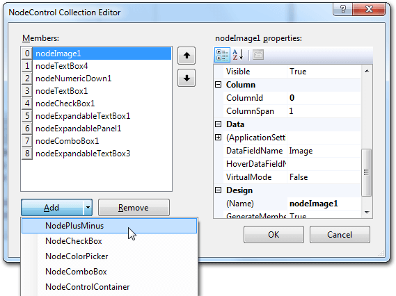
To manually control the placement of the plus-minus sign, you need to explicitly add NodePlusMinus node control to a treeview using the node controls designer:

or from code:
Tip
-
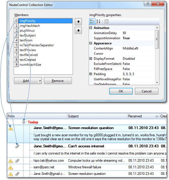
The index of the NodePlusMinus node control in the treeview node controls list will defines its location in the treeview.
-
When NodePlusMinus is added to a multi-column treeview without binding to a visible column (Visible=true), the treeview defaults to full-row highlighting (treeview.Options.Selection.HighlightMode = eNodeHighlightMode.FullRow), hiding the plus-minus sign.
After adding NodePlusMinus, it functions as an usual node control except for the following restrictions:
- You cannot hide it by changing its Visible property.
- You cannot adjust its visibility in the nodes using the Visibility property.
Visibility#
To control the plus-minus sign visibility, the following options are available:
- Options.Appearance.ShowRootPlusMinus property - shows or hides the plus-minus sign for treeview's root nodes.
- Options.Appearance.ShowChildPlusMinus property - shows or hides the plus-minus sign for child nodes, i.e. nodes displayed inside their parent nodes.
- NodePlusMinus node control, when added explicitly, also supports node control filtration as described in this topic.
RootIndent and NodeIndent#
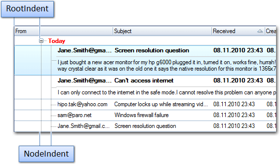
When the NodePlusMinus node control is displayed, the RootIndent and NodeIndent treeview properties determine the shift size in pixels from the left edge of the treeview.
RootIndent specifies the indent size from the left edge for all root nodes, while NodeIndent specifies the indent size from the parent node for all child nodes.

Note
If NodePlusMinus is hidden for root nodes (Options.Appearance.ShowRootPlusMinus=false), then the first node control in the root nodes will be displayed only with the indent specified in the RootIndent property. The NodeIndent property is not used for such nodes.
Even if other node controls are positioned to the left (prior) of the plus-minus sign as described below, the NodePlusMinus and subsequent node controls will still align with the indent defined by the RootIndent property, regardless of whether the total width of the node controls on the left of the NodePlusMinus exceeds the value of the RootIndent property.
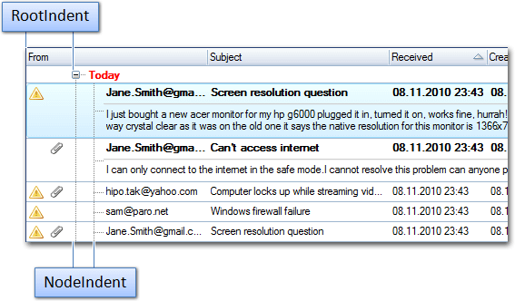
Below, even though the 'priority' and 'attachment' icons on the left have their own width, the NodePlusMinus node control is displayed with the constant indent specified in the RootIndent property:

Node controls on the left of the plus-minus sign#
Since NodePlusMinus node control functions as a general control, you may display it at any index in the node controls list so that other node controls can be displayed on the left of the plus-minus sign. At the same time, such node controls function as general ones, i.e., editing, alignment, animation, soft-selection, etc. functions are available.
For example, additional icons can be displayed on the left of the plus-minus sign:
![]()
Warning
Even if other node controls are positioned to the left (prior) of the plus-minus sign, the NodePlusMinus and subsequent node controls will still align with the indent defined by the RootIndent property, regardless of whether the total width of the node controls on the left of the NodePlusMinus exceeds the value of the RootIndent property. Therefore, adjust the RootIndent value to ensure all left-side node controls are fully visible.
The image below illustrates how the plus-minus node control position (index) within the node controls list determines the location of the plus-minus sign in the treeview:
