NodeExpandableTextBox
NodeExpandableTextBox allows you to show a text title if the node is not selected, focused, or under the mouse cursor, and the title and additional text description if the node is selected, focused, or under the mouse cursor. This allows you to not overload the treeview with information, while at the same time providing more information on the selected node when user need it.
Note
The Options.Node.AutoNodeHeight treeview option must be enabled to show an expandable node control.
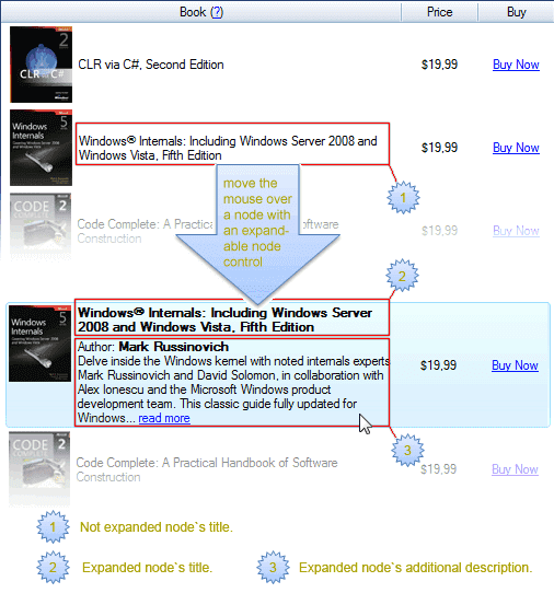
The main elements of the NodeExpandableTextBox node control are a title and description.
The image below shows that the node displays a title only (1), since the mouse cursor is not over the node, and then displays both the title (2) and description (3) if user hovers the mouse cursor over the node.

The NodeExpandableTextBox may be in three states:
- Not expanded - show only a title.
- Expanded and ShowTitleWhenExpanded property is enabled (by default) - show both the title and description when the node is in expanded state.
- Expanded but ShowTitleWhenExpanded property is disabled - show only a description when the node is in expanded state.
Example
NodeExpandableTextBox name = new NodeExpandableTextBox();
name.AttachTo(tree);

// Add node to the treeview.
NodeWithDescription node = new NodeWithDescription();
node.Text = "Node title";
node.Description = "Node description";
node.AttachTo(tree);

// Prepare treeview for auto-expanding.
tree.Options.Node.AutoNodeHeight = true;
Title#
One crucial part of the NodeExpandableTextBox node control is the title which allows you to display a short textual information and it is always displayed for a non-expanded node. For an expanded node, it is displayed only when the ShowTitleWhenExpanded is enabled (enabled by default).
To bind a title to a node class's member, set that member name in the DataFieldName node control property (it is set to Text by default), or supply the title text dynamically when the VirtualMode is enabled by subscribing to the NodeControlValueGet treeview event.
You can easily set the title's style and behavior using these properties:
- TitleStyle - defines the title style for a non-expanded node.
- TitleAlign - defines the title alignment when the title is shorter than the node control width.
- TitleSupportHtml - defines whether you can show HTML text in the title.
- TitleTrimming - defines the title trimming mode.
- TitleWrapMode - defines the title auto-wrapping mode.
- TitleBottomPadding - defines the vertical gap size in pixels between the title and description.
- ExpandedTitleStyle - defines the title style for an expanded node.
- DisplayFormat - defines the title format template.
- ShowTitleWhenExpanded - defines whether to show a title for an expanded node.
Title style#
You can easily combine the title text's style with the node control's style by using the TitleStyle.Weak property. If it is enabled, the title style combines with the node control style. If it is disabled, only the TitleStyle property settings will be used as a title text style.
Description#
Another crucial part of the NodeExpandableTextBox node control, the description, allows you to display additional information about an expanded node when it is selected, focused, or under the mouse cursor, and soft selection is enabled. If you need the description to be always visible, disable the AutoExpand property.
To bind the description to a node, adjust the appropriate node class's member in the DescriptionDataFieldName property. The bound member should be of string type.
You can easily set the description's style and behavior using these properties:
- DescriptionAlign - defines the description alignment when the description is shorter than the node control width.
- DescriptionDisplayFormat - defines the description format template.
- DescriptionStyle - defines the description style.
- DescriptionSupportHtml - defines whether you can show HTML text in the description.
- DescriptionTrimming - defines the description trimming mode.
- DescriptionWrapMode - defines the description auto-wrapping mode.
Description style#
You can easily combine the description text's style with the node control's style by using the DescriptionStyle.Weak property. If it is enabled, the description style combines with the node control style. If it is disabled, only the DescriptionStyle property settings will be used as a description text style.
Node control expansion#
The node control expansion is controlled by these parameters:
- AllowExpand - defines whether the node control may be expanded. If it is disabled, the node control will always display only the title text.
- AutoExpand - defines when the node control will be expanded. If it is enabled, then the node control will be expanded when the node is selected, or when it is under the mouse cursor and the sort selection is enabled. Otherwise, the node control will be always expanded.
To change the node control expansion behavior (by default it shows expanded in a node when AllowExpand and AutoExpand properties are true and node is focused or soft-selected) the IsExpanded method should be overridden, as shown below:
Class CustomNodeExpandableTextBox
    Inherits NodeExpandableTextBox
    Protected Overrides Function IsExpanded(node As Node, context As DrawContext) As Boolean
        ' The NodeExpandableTextBox will always be expanded for nodes with "Root" text.
        If node.Text = "Root" Then
            Return True

        End If

        Return MyBase.IsExpanded(node, context)
    End Function
End Class
HTML support#
The title and description support HTML text display by enabling the TitleSupportHtml and DescriptionSupportHtml properties respectively.
Text auto-wrapping#
Also, title and description support text auto-wrapping if it exceeds the column or treeview width. To enable it, set the wrap mode in the TitleWrapMode and DescriptionWrapMode properties respectively.