Get started
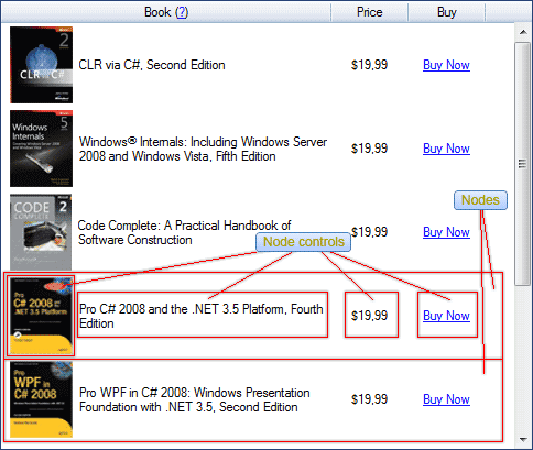
Node controls are the key differentiator between Flexible TreeView and other treeview controls on the market. Their purpose is to retrieve data (from a node instance, from an external source, etc.) and present it in a specified format within the treeview. Essentially, node controls act as data presenters and also allow users to edit and update that data.

Your treeview can contain unlimited node controls count for viewing and editing data, but at least one node control must be added to the treeview to display your data. If you find that nodes are present (and selectable) but no data is displayed in the treeview, there are a few potential reasons: either no node controls were added to the treeview, your data binding is broken, or your data is actually empty.
Every node displays all node controls you've added to the treeview, but you can dynamically or statically hide any node control for any node using node control filtration.
The treeview holds all node controls in the NodeControls property, so to show any data, you need to add particular node controls using Visual Studio designer or programmatically.
Built-in node controls#
Flexible TreeView provides these built-in node controls to display and manage different types of data:
- NodeTextBox - displays text data.
- NodeExpandableTextBox - allows you to show only a title text when the node is not focused and the title text plus description text when the node is focused or under the mouse cursor (when the soft selection is enabled).
- NodeExpandablePanel - is identical to the ExpandableTextBox, but it allows you to display custom content in the expandable area in an impressive and very professional way.
- NodeImage - displays an image and allows you to show cute eye-catching image animation.
- NodeNumeric - displays numeric values.
- NodeDateTime - displays date and/or time values.
- NodeComboBox - allows you to select one item from the dropdown list.
- NodeComboBoxEnum - is the same as NodeComboBox but supports solely enum data types.
- NodeCheckBox - displays the check box or radio button.
- NodeLink - allows you to insert a clickable hyperlink.
- NodePaintBox - allows you to paint any custom content in the node.
- NodePopupContainer - allows you to show any custom content or control in the popup.
- NodeColorPicker - allows you to select a color or color gradient using the Office2007 style color picker.
- NodeControlContainer - allows you to host any custom control inside a node.
- NodeExpandableControlContainer - allows you to host any custom control in the expandable area of an expandable node control.
- NodeSeparator - allows you to show a nice-looking horizontal line to visually divide two nodes.
- NodeColumnBackground - fills a portion of the column where it is shown with a specified color or color gradient.
- NodePlusMinus - allows you to customize the
plus-minussign appearance in the treeview. - NodeProgressBar - displays the progress bar in the treeview node.
- NodeButton - displays the button in the treeview node and allows you to handle clicks on it.
- NodeMarker - draws a marker line to the left of each node.
Data binding#
To display data inside a node control, you need to bind that node control to the appropriate data. See the Data binding article for details.
Create node control#
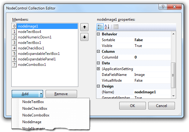
You can add a node control in the Visual Studio designer of the NodeControls property:

or programmatically:
Tip
Any action that you can do in the designer, you can do programmatically too.
NodeCheckBox ctrl = new NodeCheckBox();
// bind the node control to the Node.CheckState property.
// Note that the NodeCheckBox node control is bound to that property by default, so you don't need this line apparently.
ctrl.DataFieldName = "CheckState";

// show this node control within the targetColumn column (for treeviews with columns only).
ctrl.ColumnId = targetColumn.Id;     // or ctrl.AttachToColumn(targetColumn);
tree.NodeControls.Add(ctrl);

// add node.
Node node = new Node("Test node");
// NodeCheckBox shows checked for this node.
node.CheckState = eCheckState.Checked;
// set check type: check box.
node.CheckType = eCheckType.CheckBox;
// or for radio button:
// node.CheckType = eCheckType.RadioButton;
node.AttachTo(tree);
Dim ctrl As New NodeCheckBox()
' bind the node control to the Node.CheckState property.
' Note that the NodeCheckBox node control is bound to that property by default, so you don't need this line apparently.
ctrl.DataFieldName = "CheckState"

' show this node control within the targetColumn column (for treeviews with columns only).
ctrl.ColumnId = targetColumn.Id
' or ctrl.AttachToColumn(targetColumn);
tree.NodeControls.Add(ctrl)

' add node.
Dim node As New Node("Test node")
' NodeCheckBox shows checked for this node.
node.CheckState = eCheckState.Checked
' set check type: check box.
node.CheckType = eCheckType.CheckBox
' or for radio button:
' node.CheckType = eCheckType.RadioButton;
node.AttachTo(tree)
Node control visibility#
Flexible TreeView allows you to flexibly control the node control visibility. See this topic for details.
FillFreeSpace#
By default, a node control fills an area equal to the size of the data it shows, but often you need to use all of a column's or treeview's width to display data. To do that, enable the FillFreeSpace property, and the node control fills all the available space to display data.
Note
When the FillFreeSpace property is enabled for a node control, all node controls after this one become invisible.
ContentAlign#
Generally, every node control's bounds are equal in size to the node control content. But, sometimes you can force the node control to grab a bigger area than its content requires (for instance, by enabling the FillFreeSpace property). In this case, you have the ability to align the node control within that wider grabbed area using the ContentAlign property.
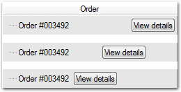
For example, below we tell the NodeButton node control to grab all the remaining column space and align its content to the middle-right side.
Node control content can be aligned in various ways, as demonstrated in the sample image below. The example illustrates different alignments of a button, implemented using the NodeButton control.

Padding#
By default, node controls are tightly grouped within the node. To enhance usability, you can specify a gap size in pixels for each control's border using the Padding node controlproperty.
ExcludeFromSelection#
Flexible TreeView highlights node controls within selected nodes based on the Options.Selection.HighlightMode configuration.

To customize the selected node's appearance, you can exclude specific controls from the highlighted area by enabling their ExcludeFromSelection property.

StaticValue#
While node control content typically derives from node class instances or dynamic generation, there are scenarios where static content display is preferable without node binding. In such cases, use the StaticValue property of the node control to set static data, eliminating the need to store this information in individual nodes.
Virtual data mode#
Many node controls support virtual data binding, which doesn't directly bind to node properties. Instead, when data is needed, the treeview triggers NodeControlValueGet and NodeControlValueSet events. In these events, you supply or save data from external sources (like databases, files, or networks), eliminating the need to store data in the node itself.
To use virtual mode:
- Enable the VirtualMode property on the node control.
- Subscribe to the NodeControlValueGet and NodeControlValueSet treeview events.
Example
// node control class's member to show virtual data.
private NodeTextBox textBox;
// virtual data storage.
private string nodeText;

// create the node control to show virtual data.
textBox = new NodeTextBox();
// enable virtual mode to request data through the NodeControlValueGet event.
textBox.VirtualMode = true;
// allow data edit to store text changes through the NodeControlValueSet event.
textBox.Editable = true;
textBox.AttachTo(tree);

Node node = new Node();
// default node title.
nodeText = "Node title";
node.AttachTo(tree);

// subscribe to events to provide/save data.
tree.NodeControlValueGet += tree_NodeControlValueGet;
tree.NodeControlValueSet += tree_NodeControlValueSet;

bool tree_NodeControlValueGet(FlexibleTreeView treeview, NodeControlValueEventArgs args)
{
    // provide data for our text box.
    if (args.NodeControl == textBox)
    {
        args.Value = nodeText;
        return true;
    }
    return false;
}

void tree_NodeControlValueSet(FlexibleTreeView treeview, NodeControlValueEventArgs args)
{
    // save data changes.
    if (args.NodeControl == textBox)
    {
        nodeText = args.Value as string;
    }
}
' node control class's member to show virtual data.
Private textBox As NodeTextBox
' virtual data storage.
Private nodeText As String

' create the node control to show virtual data.
textBox = New NodeTextBox()
' enable virtual mode to request data through the NodeControlValueGet event.
textBox.VirtualMode = True
' allow data edit to store text changes through the NodeControlValueSet event.
textBox.Editable = True
textBox.AttachTo(tree)

Dim node As New Node()
' default node title.
nodeText = "Node title"
node.AttachTo(tree)
' subscribe to events to provide/save data.
AddHandler tree.NodeControlValueGet, AddressOf tree_NodeControlValueGet
AddHandler tree.NodeControlValueSet, AddressOf tree_NodeControlValueSet

Private Function tree_NodeControlValueGet(treeview As FlexibleTreeView, args As NodeControlValueEventArgs) As Boolean
    ' provide data for our text box.
    If args.NodeControl Is textBox Then
        args.Value = nodeText
        Return True
    End If
    Return False
End Function
Private Sub tree_NodeControlValueSet(treeview As FlexibleTreeView, args As NodeControlValueEventArgs)
    ' save data changes.
    If args.NodeControl Is textBox Then
        nodeText = TryCast(args.Value, String)
    End If
End Sub
Find node control#
To find a specific node control, use the treeview's GetNodeControlAt method. This method takes the target node and the control's location within that node as input parameters.
Customize node control text format#
Node controls offer flexible customization of text format and appearance. See this topic for details.
Sortable#
To use a node control's content for sorting in the treeview, ensure the Sortable property of the node control is enabled. This property is enabled by default.
Additional API reference#
Properties#
- SupportHtml - determines if the node control displays HTML text. Not supported by all node controls.
- TextWrapMode - controls auto-wrapping of text exceeding bounds. Not supported by all node controls.
- Cursor - sets the mouse cursor for the node control.
Methods#
- GetValue - gets the bound node member's value. Protected method that's accessible to inherited node control classes.
- GetValue
or GetValueAsString - gets the bound node member's typed value. Protected method that's accessible to inherited node control classes. - SetValue - sets the bound node member's value. Protected method that's accessible to inherited node control classes.
- GetFont - gets text font for specified node and context. Useful for custom node controls.
- GetTextColor - gets text color for specified node and context. Useful for custom node controls.
- GetBounds - gets node control's bounds rectangle.
- AttachToColumn - binds node control to a column where it will be displayed.
- AttachTo - binds node control to a treeview where it will be displayed.